Author: Dingyi Tang
-
Positions through iterating – Written component
Line of Enquiry/Summary Statement:
This project began as a technical problem in Unit 1. Our CSM light archive loaded slowly because the image files were too heavy. What started as a practical experiment in image compression opened, after a week, into a question I had not expected: why do people love degraded images? Not tolerate them, not merely use them, but love them — save them, collect them, return to them. JPEG blocks, colour shifts, multi-generational compression: these are not defects that viewers simply overlook, but qualities they are drawn to. If circulation damages the image, why is that damage so often loved?
Hito Steyerl’s “In Defense of the Poor Image” gave me part of the answer. She explains the poor image through circulation, access, and political mobility: the image has value because it moves. What interests me, however, is something slightly different. The attachment I am describing is not only functional, but affective and aesthetic. There is a name for this kind of attachment in Chinese antique collecting: 包浆 (bāojiāng), which means the lustrous patina that accumulates on an object through years of handling and increases its value. I want to argue that digital images, through repeated circulation and compression, develop a parallel digital patina (电子包浆). What looks like degradation may also function as value, like a visible record of time, use, and deformation.
To create my visual outcome, I find another object related to time and change. That is fossil. I realised that they are patina taken to its extreme form. The whole world doing patina to the fossil. Where antique patina records years of human handling, and digital patina records months of platform-handling, fossilisation records millennia of the earth’s handling. They are the same gesture at different speeds.”
I created the website “The Meme Fossil Archive” as an archive. It selects some of the most (now 20) famous memes. Through the format of fossils, they preserve only the line-work surviving heavy circulation. Each archive also contains details, rewritten based on real archives, simulating the discovery and processing of fossils.Annotated bibliography:
1 · Hito Steyerl — In Defense of the Poor Image
(a) Steyerl, H. (2012) ‘In Defense of the Poor Image’, in The Wretched of the Screen. Berlin: Sternberg Press, pp. 31–45. (Originally published in e-flux Journal, 10, November 2009.)
(b) The poor image is a copy in motion. Its quality is bad, its resolution substandard. As it accelerates, it deteriorates. It is a ghost of an image, a preview, a thumbnail, an errant idea, an itinerant image distributed for free, squeezed through slow digital connections, compressed, reproduced, ripped, remixed, as well as copied and pasted into other channels of distribution.
(c) This essay reframed the technical problem I had been treating as an engineering challenge. In Week 1 I was authoring compression, selecting parameters, comparing outputs. Steyerl’s description of the poor image as “a copy in motion — squeezed through slow digital connections, compressed, reproduced, ripped, remixed” made visible the compression I had been ignoring: the kind performed automatically, continuously, by every platform an image passes through. This shifted my position from designer-of-compression to observer-of-compression. The Week 2 iterations are no longer filters I apply to a photograph but stages I document in the passage of a photograph through real networks. Steyerl also turns the question of image quality into a political one: resolution is not a neutral property but a distribution of visibility. An image that is “poor” is also an image that has travelled, been seen, survived. This is the framing that now organises my work.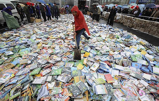
2 · Walter Benjamin — The Work of Art in the Age of Mechanical Reproduction
(a) Benjamin, W. (1969) ‘The Work of Art in the Age of Mechanical Reproduction’, in Arendt, H. (ed.) Illuminations. Translated by H. Zohn. New York: Schocken Books, pp. 1–26. (Originally published 1935.)
(b) Even the most perfect reproduction of a work of art is lacking in one element: its presence in time and space, its unique existence at the place where it happens to be.
(c) Benjamin describes mechanical reproduction as the historical event that emptied the artwork of aura — the specific weight of being one thing in one place. My project starts where his ends. The image-objects I work with have no original to lose: a meme is born already as a copy. And yet they are not aura-less. What collects on them is something else — a record of having been handled, screenshotted, cropped, reposted, run through one platform’s compression and then another.3 · Daniel Rubinstein & Katrina Sluis — The Digital Image in Photographic Culture: Algorithmic Photography and the Crisis of Representation
(a) Rubinstein, D. and Sluis, K. (2013) ‘The Digital Image in Photographic Culture: Algorithmic Photography and the Crisis of Representation’, in Lister, M. (ed.) The Photographic Image in Digital Culture. 2nd edn. London: Routledge, pp. 22–40.
(b) The distinction between photography as an archive of memory and photography as an image of time in crisis allows us to suggest that the technologies that create interactive image systems also threaten photography’s representational paradigm through the production of a computational image. As we will explain in this chapter, the digital image is an image/software machine that operates on several levels at once, some visual, others computational, operating within media ecologies involving both human and non-human actors.
(c) Rubinstein and Sluis argue that the photograph, in the era of networked computation, has become less an index of the world and more a product of algorithms. The “crisis of representation” they describe is not about image quality but about what an image now is: a computational event subject to continuous processing. This reframing supports the move I am trying to make in my project. When I send a photograph of a CSM lamp through WeChat, the file that arrives on my friend’s phone is not simply my photograph slightly degraded; it is an image that has been reconstructed by the platform’s compression algorithm. Rubinstein and Sluis help me articulate why it is insufficient to treat this as a technical nuisance: the algorithm is producing the image, not merely transporting it. My iterations document this production.4 · Limor Shifman — Memes in Digital Culture
(a) Shifman, L. (2014) Memes in Digital Culture. Cambridge, MA: MIT Press.
(b) Shifman defines an internet meme as “a group of digital items sharing common characteristics of content, form, and/or stance, which were created with awareness of each other, and were circulated, imitated, and/or transformed via the internet by many users.
(c) Shifman’s definition is the one I am taking the most operational use from. Two things in it matter directly to the archive. First, the meme is not a single image but a family of items — which is why my fossils sometimes preserve a lineage rather than a single specimen. Second, Shifman’s three modes — circulated, imitated, transformed — give me a vocabulary for the soft tags I attach to each fossil (provenance, spread, condition, template affordance).5 · Rosa Menkman — The Glitch Moment(um)
(a) Menkman, R. (2011) The Glitch Moment(um). Amsterdam: Institute of Network Cultures (Network Notebooks 04). Available at: https://networkcultures.org/_uploads/NN%234_RosaMenkman.pdf (Accessed: 23 April 2026).
(b) “A glitch is a wonderful interruption that shifts an object away from its ordinary form and discourse, towards the ruins of destroyed meaning.”
(c) Menkman takes a clear position: the compression artefact is not noise to be eliminated but a site of critical attention — the moment where an otherwise invisible infrastructure becomes readable. This is the position my documentation also takes. I am not recording platform circulation to lament quality loss, nor to aestheticise it. Menkman lets me distinguish my project from two nearby traps I kept sliding into during Week 1: the nostalgic “degradation is beautiful” move, and the technical “compression is a problem to optimise” move. My position is closer to hers.6 · Aria Dean — Poor Meme, Rich Meme
(a) Dean, A. (2016) ‘Poor Meme, Rich Meme’, Real Life Magazine, 25 July. Available at: https://reallifemag.com/poor-meme-rich-meme/ (Accessed: 23 April 2026).
(b) Like the poor image, the meme finds its home only in this circulation — its true content is the many bumps and bruises that have occurred along the way. It is a copy without an original — a copy of a copy of a copy, and so forth. For better or worse, a meme asks instead to be considered as its total sum presence in circulation.
(c) Dean extends Steyerl’s argument from the art image to the meme — a form whose visual language is shaped directly by the infrastructure of repeated compression, screenshotting, caption-editing, and re-upload. Her essay gives me a vocabulary for a specific visual register I keep encountering in my iterations: the “deep-fried” register, where colour saturation over-boils, JPEG blocks surface as texture, and the image appears to have eaten the history of its own distribution. Dean lets me treat this register as content rather than aesthetic accident. A deep-fried image of a CSM lamp is not a failed image; it is an image that has accumulated the traces of every platform it has passed through.References:
Steyerl, H. (2009) ‘In Defense of the Poor Image’, e-flux journal, (10). Available at:
https://www.e-flux.com/journal/10/61362/in-defense-of-the-poor-image/
(Accessed: 24 April 2026).Benjamin, W. (1969) ‘The Work of Art in the Age of Mechanical Reproduction’, in Arendt, H. (ed.) Illuminations. Translated by H. Zohn. New York: Schocken Books, pp. 1–26.
Rubinstein, D. and Sluis, K. (2013) ‘The Digital Image in Photographic Culture: Algorithmic Photography and the Crisis of Representation’, in Lister, M. (2013) The Photographic Image in Digital Culture. 2nd edn. London: Routledge, pp. 22–40.
Shifman, L. (2014) Memes in Digital Culture. Cambridge, MA: MIT Press.
Menkman, R. (2011) The Glitch Moment(um). Amsterdam: Institute of Network Cultures (Network Notebooks 04). Available at: https://networkcultures.org/_uploads/NN%234_RosaMenkman.pdf (Accessed: 23 April 2026).
Dean, A. (2016) ‘Poor Meme, Rich Meme’, Real Life Magazine, 25 July. Available at: https://reallifemag.com/poor-meme-rich-meme/ (Accessed: 23 April 2026).
-
Methods of contextualising – Writting Response
GROUP DRAFT:
REFLECTION DRAFT:
1.Anderson, B. (2006) ‘Census, Map, Museum’, in Imagined Communities: Reflections on the Origin and Spread of Nationalism. Rev. edn. London: Verso, pp. 163–185.
Anderson’s argument that counting and mapping do not simply record reality but help produce it changed how I read our own dataset. In E2CITY, we treated light fixtures as measurable units—photographing, categorising and placing them into a grid to make electricity legible. Through Anderson’s lens, this is not a neutral act. Our categories (type, location, status, wattage) are a way of “imagining” the building as an ordered system. This matters for climate justice because institutional targets like Net Zero often rely on quantification to justify action, yet quantification also decides what becomes visible and what remains hidden. The website can therefore operate in two directions: it can reveal excess and accountability, but it can also risk reproducing a managerial viewpoint, where the building becomes a controllable inventory. This reference pushed me to ask whether our interface is only exposing infrastructure, or also shaping an institutional narrative about energy that privileges what can be counted over what can be experienced or contested.
2.Haraway, D. (1988) ‘Situated Knowledges: The Science Question in Feminism and the Privilege of Partial Perspective’, Feminist Studies, 14(3), pp. 575–599.
Haraway’s idea of “partial perspective” helped me frame our project as situated observation rather than universal truth. We worked inside CSM, through specific floors, access limits, and conversations with facilities staff. Our wattage values are estimates; our dataset is shaped by what we could see, photograph, and confirm. Instead of treating these constraints as weaknesses, Haraway lets me articulate them as part of the knowledge we produce: the building’s energy system is not fully transparent to users, and that opacity is itself an institutional condition. For climate justice, this matters because responsibility is often displaced onto individual behaviour (“turn off the light”), while the operational structure of buildings remains unexamined. Our website can make that structure felt: grouped switching, permanently lit zones, and the gap between user intention and infrastructural reality. Haraway supports a position where design does not claim total objectivity, but makes visible how knowledge about energy is produced—through access, power, and lived experience.
3.Mattern, S. (2021) A City Is Not a Computer: Other Urban Intelligences. Princeton, NJ: Princeton University Press.
Mattern’s critique of treating cities as computable systems challenged my instinct to “solve” energy visibility through interface logic alone. E2CITY uses a grid and interactive switching to model accumulation, which is effective for showing patterns of density and scale. But Mattern warns that computational metaphors can flatten complex urban (and institutional) life into dashboards and control panels. This helped me question whether our website risks becoming another “management” interface—one that makes energy legible but also implies that legibility equals control. In climate justice terms, this is a key tension: systems that visualise consumption can empower awareness, yet they can also support technocratic narratives where problems are framed as optimisation tasks rather than political choices. Mattern pushed me to think about what our interface cannot capture: the reasons lights remain on (security protocols, labour schedules, institutional priorities), and the uneven ability of users to intervene. This reference suggests a development direction: designing the interface to show uncertainty, constraints, and institutional decision points—not only numbers and switches.
4.Easterling, K. (2014) Extrastatecraft: The Power of Infrastructure Space. London: Verso.
Easterling’s idea that infrastructure acts like an operating system, setting rules that shape everyday behaviour. It gave me a clearer language for what we observed in CSM. Our initial framing focused on “lights” as objects and “waste” as an outcome. Easterling helped reframe the issue as infrastructural power: lighting systems organise who can control what, when, and at what scale. This connects strongly to climate justice because responsibility is not evenly distributed. A student can switch off a local lamp, but cannot reconfigure motion sensors, default settings, or grouped circuits. Our website became more than a visual archive after reading Easterling: it can be understood as a model of infrastructural governance, where interaction reveals limitation. This reference also warns against focusing only on visible surfaces. Glass façades make CSM’s creative work visible at night, but the infrastructural rules that maintain that visibility are hidden. Easterling encouraged me to treat the interface as a way to expose those rules—clusters, permanence, and systemic defaults—rather than simply displaying “more data.”
5.Forensic Architecture (2017) Forensic Architecture: Violence at the Threshold of Detectability. Zone Books.
Forensic Architecture shaped how I think about evidence and accountability through visual methods. Although their work addresses state violence rather than energy, the methodological parallel is direct: they assemble partial traces—images, spatial models, witness accounts—into public forms of proof that challenge official narratives. This helped me position E2CITY beyond “data visualisation” and closer to an evidentiary practice. Our photographs of fixtures, catalogues of types, and approximated wattage are not only descriptive; they can become a claim about institutional conditions: persistent lighting, grouped control, and the normalisation of continuous consumption. For climate justice, this framing matters because institutional targets often remain abstract and accountability is diffuse. Forensic Architecture shows how designed interfaces can support public reasoning—making systems legible without pretending to be complete or neutral. Their emphasis on thresholds of detectability also resonates with our project: energy waste is not always obvious until it is assembled, compared, and scaled. This reference encourages us to treat the website as a platform for argument—where methodology is visible, uncertainty is acknowledged, and the goal is not aesthetic impact but public accountability.
6.Metahaven (2004) Sealand Identity Project. Available at: https://www.itsnicethat.com/features/metahaven-version-history-exhibition-world-mental-health-day-101018?utm_source (Accessed: 2 March 2026).
Metahaven’s Sealand project helped me understand design as research rather than branding. They treat identity not as a final “look” but as a way to investigate geopolitics, storytelling, and legitimacy. This strongly informed how I see our website: not as a polished endpoint, but as a device for enquiry—testing how infrastructure becomes meaningful when organised into patterns. In E2CITY, switching and grouping functions are not just interaction features; they are questions about who has control and how institutions structure behaviour. Metahaven’s approach legitimises this kind of speculative, systems-based interface: the design does not simply represent a reality, it probes the rules that hold that reality together. For climate justice, this matters because institutions often communicate Net Zero through clean narratives and simplified metrics. Metahaven suggests an alternative: use design to expose contradictions and constructedness. This reference pushed me to consider adding friction into our interface—moments where control fails, where estimation is visible, or where a “neutral” grid becomes an argumentative form.
References:
Anderson, B. (2006) ‘Census, Map, Museum’, in Imagined Communities: Reflections on the Origin and Spread of Nationalism. Rev. edn. London: Verso, pp. 163–185.
Haraway, D. (1988) ‘Situated Knowledges: The Science Question in Feminism and the Privilege of Partial Perspective’, Feminist Studies, 14(3), pp. 575–599.
Mattern, S. (2021) A City Is Not a Computer: Other Urban Intelligences. Princeton, NJ: Princeton University Press.
Easterling, K. (2014) Extrastatecraft: The Power of Infrastructure Space. London: Verso.
Forensic Architecture (2017) Forensic Architecture: Violence at the Threshold of Detectability. Zone Books.
Metahaven (2004) Sealand Identity Project. Available at: https://www.itsnicethat.com/features/metahaven-version-history-exhibition-world-mental-health-day-101018?utm_source (Accessed: 2 March 2026).